GIVE ME AN “S”, give me an “O”, give me an “R-R-Y”! What’s that spell? SORRY! Why am I sorry? Because I’ve been MIA for so long! I was on vacay last week and I’m not famous enough to have guest bloggers write for Embrace My Space during my absence. Someday….A girl can dream, right?
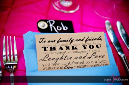
Now we’ll get down to the reasoning for my sudden perkiness verbally manifested through obnoxious cheerleading: TYPOGRAPHY! Man, do I love a good font. In high school and college, I was obsessed with scrapbooking and would spend hours piecing together scrapbook pages and accenting each page with titles and captions written with beautiful hand-drawn letters. As I matured (i.e., found myself a big girl law job), I turned to less time-consuming ways to have fun with typography. One such project was this little number that I created for our wedding:

Photo: My fantabulous wedding photog Studio Julie!
I typed up this little sentiment in Word using a variety of fonts and had one printed up for each guest at our wedding. Pretty rad, huh? Did you guys know that Steve Jobs was responsible for making beautiful typography accessible to all by introducing it as a feature on the first ever Mac? And, incidentally, my husband was responsible for the selection of those electric pink table linens at our wedding.
Not only does typography make for beautiful scrapbook pages and wedding goodies, it also makes for cool or quirky home decor. Check out this scrambled alphabet artwork spicing up this minimalist kitchen. It’s fun and crazy; just don’t let the kiddos do their homework at the table until they’ve learned their ABCs.

Photo: Boho Modern
Typography can also be very literal. Imagine that. Using a word or phrase that means something to you is a great way to add a personal touch to your home decor. At our first place, the phrase “Here Comes The Sun” greeted guests in our front entry.
While I love the sunny yellow color and the way the phrase compliments our wooden sun artwork, it is even more meaningful because it was the song I walked down the aisle to when Matt and I got married in Key West. It always made me happy when I came home from a long day at the office, which leads me to my #1 rule for decorating your home. Surround yourself with things that make you happy. You’re the one who has to live with them!
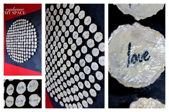
I also love incorporating typography into wall galleries, like this fun little vignette that was in our dining room. The “Holla” and “Here Comes the Sun” signs both came from Oh Dier! I found Oh Dier via Etsy.com and they are the bomb if you love typography art. The gilt frame houses a chalkboard that I DIYed to use as a menu board at our wedding. After the big day I decided it would be cool to use the chalkboard as an ever-changing piece of art on our gallery wall. The drawing changes with each season or event. Holla!  One of my favorite examples of typography artwork is this piece that hangs in the dining room at the home we rent in Jamaica each August. From afar, it looks like a giant golf ball. When you get up close you see that each tiny little circle includes a different word, all of which come together to form a gorgeous, meaningful ball of typography goodness.
  If you’re struggling to find the perfect art that conveys just the right message in your home, why not take out the guesswork and use art that says exactly what you mean it to say? Already tried this trend at your home? I’d love to learn the interesting ways you all have used the ABCs as conversation pieces in your homes. For even more great ideas of how to incorporate typography into your decor, check out this article on Houzz.
xoxoSara


Pingback: Etsy Find of the Week: Oh Dier « embrace my space
Pingback: Inspired Design Challenge: DIY Typography Mirror | embrace my space